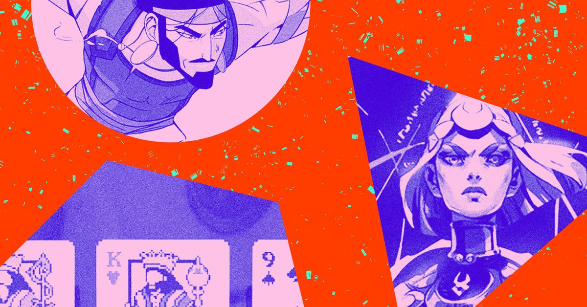
The Verge art team was busy this year, creating illustrations, photographs, and interactive designs to match stories about underwater sea cables, competitive Excel, parental anxiety, AI companions, and so much more. Here’s a look back at 20 of our favorite projects from 2024, with comments from those of us who worked on the project.
In a special issue on the year 2004, The Verge looked 20 years back to examine how 2004 was “the year of the future,” setting in motion the internet as we know and use it today. Cath Virginia absolutely crushed the hub design (with three skins! Remember skins?), Graham MacAree built the smoothest pages, and Amelia Holowaty Krales took the early aughts photos of my dreams. This package is both a love letter to a time we all saw ourselves for the first time online and a capsule of what we hope it can become again: a place for play, creativity, and connection. – Kristen Radtke, creative director
Photography by Go Takayama
For Josh Dzieza’s feature on the hundreds of thousands of miles of internet cables at the bottom of the world’s oceans — and the people who fix and tend to them — we created an immersive electric blue world of maps and schematics. It’s great to have an opportunity to mash up data visualizations and maps along with stunning original photography, and Go Takayama’s intimate photos of these seafaring men give a face to an essential but otherwise invisible job. – Kristen Radtke, creative director
Photography by Stormy Pyeatte
The visuals for these pieces are one of my proudest Verge projects. Stormy Pyeatte’s ethereal style of floral photography and projection mapping makes for a rhythmic and mesmerizing feature design — it almost makes you want to fall in love. – Cath Virginia, senior designer
We started this story trying to figure out how on earth a bunch of Excel nerds ended up on ESPN. We ended up discovering exactly how powerful, versatile, and important spreadsheets really are and the power they confer when you can reduce the world to rows and columns. In the process, our brilliant design team found yet another way to build a spreadsheet: to use rows and columns to tell the story, and depict its characters, in their natural habitat. – David Pierce, editor-at-large
Photography by Amelia Holowaty Krales
Every once in a while, we go bananas on a special-edition print project, and for our subscription launch this year, we somehow convinced our colleagues to pose in 1980s office wear for our Content Goblins magazine. It’s an issue about the enshitification of the internet, so I basically lobbed as much goop and slime on top of the design as possible. Our A/V producer Andrew Marino was the real MVP of this project for letting us turn him into a literal goblin. – Kristen Radtke, creative director
The occupant of a home filled with “smart” technology — speakers, lights, a robovac — sits by the window and ignores the tech in favor of gazing at the trees and clouds outside. Adrián Astorgano’s vibrant art gives us a moving (both figuratively and literally) picture of how today’s smart homes are useful and even preferable, but not an end in themselves. –Barbara Krasnoff, reviews editor
Getting Kristen Radtke’s beautiful comic up on the site was an interesting challenge: how do we preserve the artwork and animation without compromising on performance? I think the amount of work done to optimize the piece ultimately paid off in the user experience. It’s our smoothest comic yet. – Graham MacAree, senior engineer
I love everything that Samar Haddad makes, especially how she breaks down complex topics step by step in clever visual ways. For this short series on AI in sports, she created a massive suite of graphics in a cool retro vibe. I hate sports, and I love this series. – Kristen Radtke, creative director
Photography by Amelia Holowaty Krales; design by Maeve Sheridan and Cath Virginia
Creating the lede images for our gift guides is a big job each year. We source all the products, create distinct sets for each guide, and try to keep things fresh for the whole suite. I love the joyful scenes photographer Amelia Holowaty Krales created this year with prop stylist Maeve Sheridan, with bold, poppy wrapping papers designed by our senior designer Cath Virginia. You can even buy your own custom Verge wrapping paper from our merch store. – Kristen Radtke, creative director
Photography by Amelia Holowaty Krales
I was so excited to head to a party with Verge senior photographer Amelia Holowaty Krales: one, because it meant we were both off the hook for bedtime with our respective kids, and two, because she can communicate a vibe so sharply through her lens. Her photos from the Pantone Color of the Year party are visual arguments in themselves, and her use of double exposures throughout perfectly communicates the branded extravaganza of the evening. – Kristen Radtke, creative director
Art by Cath Virginia with photos from Getty Images
There’s a lot to call out in this great, cohesive collection of images that helped bring our physical media issue to life. But I have to put a spotlight on the floppy disk turned turntable, which is as clever as it is mesmerizing. – Andrew Webster, senior editor, entertainment
Art by Cath Virginia, assets from TurboSquid
The most recognizable part of Pitchfork — besides its logo — is its 10-point rating scale. How do you convey the diminishment of an august music publication? You just turn the volume down. – Elizabeth Lopatto, senior reporter
Photography by Amelia Holowaty Krales
Wearables — especially smart rings — tend to be small gadgets. So when it comes to art, it’s really important to think about how to make them pop on the page while also differentiating them from each other. (Let’s be real, watches and rings start to look an awful lot alike after a while.) Cue fun, colorful props and sparkly nails! – Victoria Song, senior reviewer
Design by Mr.Nelson with photos from Getty Images
In one of the most depressing election cycles of all time, Wouter Tjeenk Willink, aka Mr.Nelson, did an apt job with these uncomfortably chaotic collages. – Cath Virginia, senior designer
When people grow old, they don’t stop being individuals capable of joy. Mojo Wang’s imaginative drawing of an older woman in celebration of her favorite music beautifully illustrates an article that explains how the writer’s mother used a smart speaker to enhance the final chapters of her life. – Barbara Krasnoff, reviews editor
Art by Cath Virginia with photos from Getty Images
I’ve spent the last few years writing about all the ways search engine optimization infiltrates Google, making for a frustrating experience for both users and website operators. This image perhaps perfectly encapsulates SEO at its worst: insidious, corrosive, and just plain gross. – Mia Sato, platforms and communities reporter
Art by Cath Virginia with photos from Getty Images
Basically my favorite part of the story process is finding out what madness our art team has cooked up this time. In this case, I think I told Cath Virginia that I felt like the “it’s all Ohio” meme as I was reporting the story — it’s all copyright law and always has been. And she went galaxy brain with it. – Elizabeth Lopatto, senior reporter
Richard Parry’s playful 3D animations perfectly express the cult status of the infamous Optimus Maximus keyboard. – Cath Virginia, senior designer
Vice was never as big and solid as Shane Smith made it seem, and the story had a cartoonish surrealness to it that was captured perfectly in Hunter French’s illustrations — whether that was the Buster Keaton-inspired lead art or Smith hawking the brand in secretive deals. Sure, there are a bunch of complicated financial details, but the art really gets to the heart of the thing, doesn’t it? – Elizabeth Lopatto, senior reporter
Photography by Liam James Doyle and Montinique Monroe
Mia Sato’s piece about a lawsuit involving two Amazon influencers is amazing, and the photographs of these two individuals are a perfect pairing. The portraits that Montinique Monroe and Liam James Doyle took in Austin, Texas, and Minneapolis, Minnesota, respectively, were individually fantastic and worked so well together, it was really hard to choose which to use. – Amelia Holowaty Krales, senior photographer

